CLIENT:
ARKOV

ABOUT THE PROJECT
Arkov
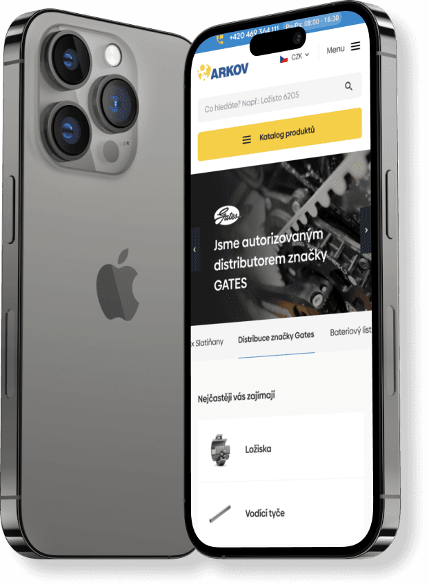
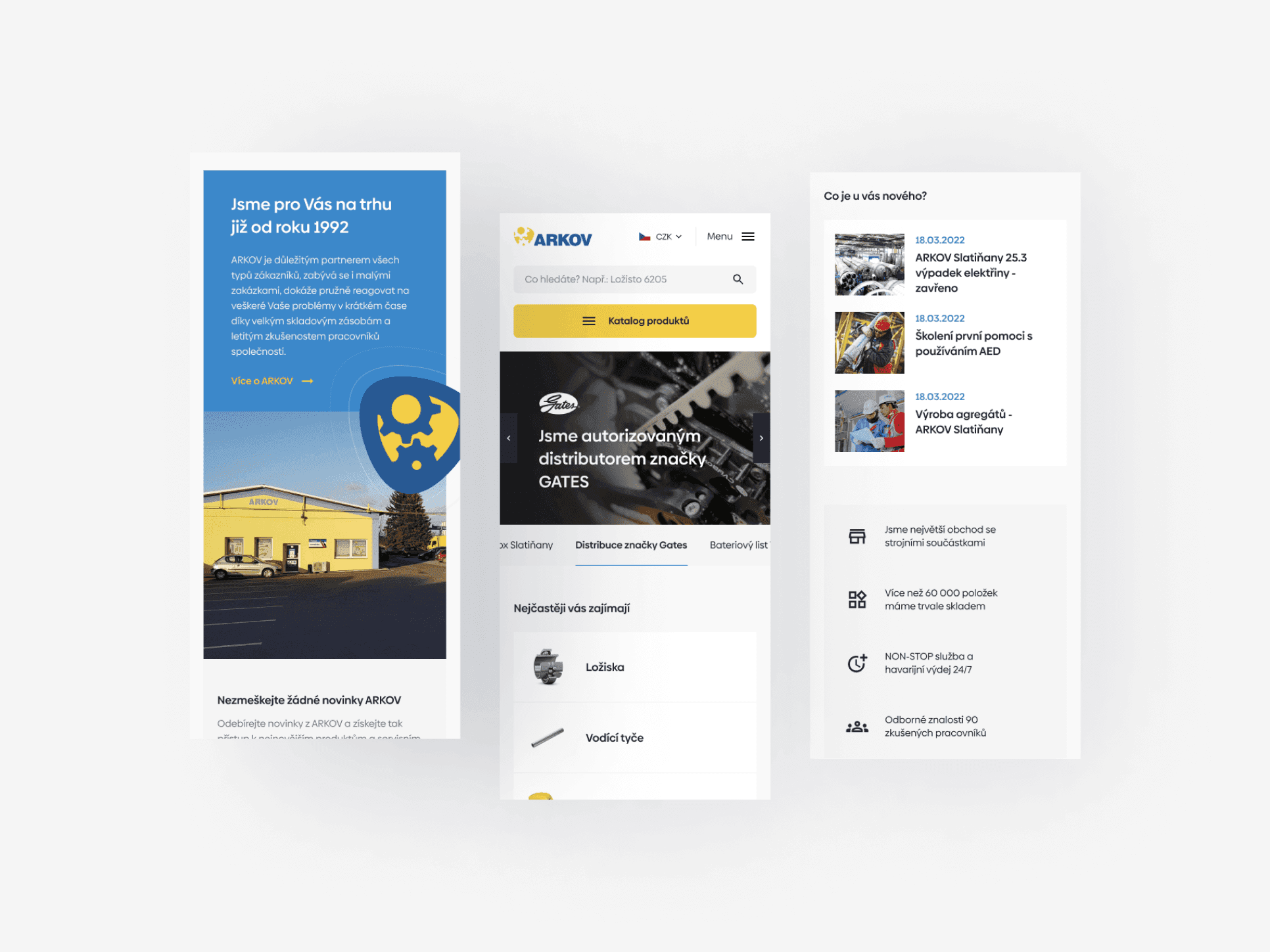
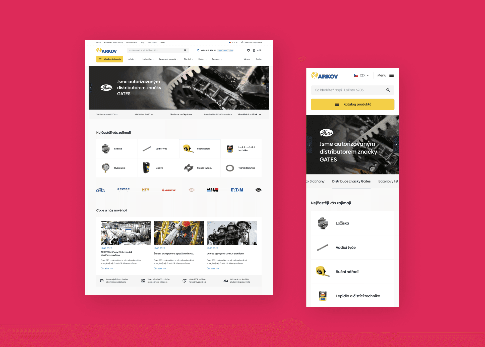
We approached the redesign of the Arkov website empathetically towards the target group, which appears to be conservative and more focused on performance and response speed, and more resistant to trends and visually rich and provocative designs.
The focus of our work, therefore, was on fine-tuned UX aimed at speed of search and filtering in a vast catalog and a convenient and accelerated purchasing process. Additionally, we created everything with respect to the Arkov.cz brand and the technologies used on the backend and frontend.


#FFFFFF
#DD2A59
#F4CF47
#3C88CA
Colors
At the same time as the new website design, we updated the basic set of 4 colors. The saturation and fullness have been increased for a better impression, and the contrast is higher.